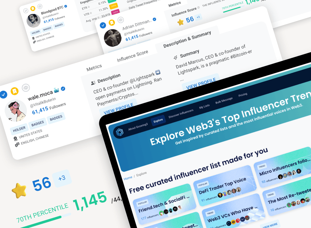
Turning a manual service into a scalable product
Before the product existed, our team built audience packages manually.
We analyzed wallet behavior, created targeting lists for each client, and handed them off to marketers to run campaigns.
It worked — but every new customer required more manual work.
The product challenge was to turn this service into something marketers could do themselves.
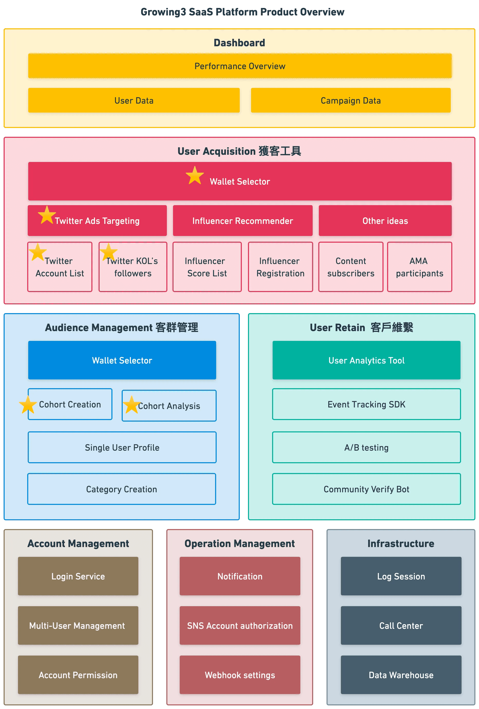
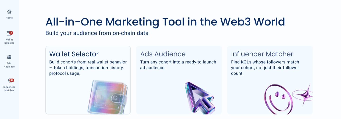
Building the first self-serve workflow
I started by studying workflows marketers already knew from Web2 advertising platforms and mapped them to our Web3 targeting model.
The first product flow came down to three steps:
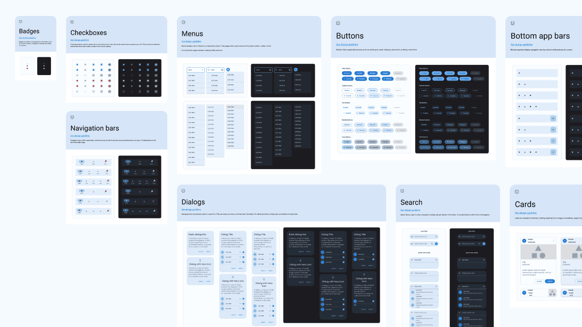
I used familiar Material Design patterns to build the first prototype quickly and validate the workflow with users.
The hardest part: making Web3 targeting understandable
The underlying targeting logic was much more complicated than what marketers were used to.
The UX challenge was giving marketers this power without forcing them to understand the complexity underneath.
Preventing users from building the wrong audience
In the first flow, marketers stacked filters one after another and only discovered at the end whether their audience was usable.
Too narrow or too broad — either way, they had already built the whole cohort.
My first instinct was to show the audience size after every change.
But querying live blockchain data continuously was slow and expensive.
That constraint led to four key design decisions.
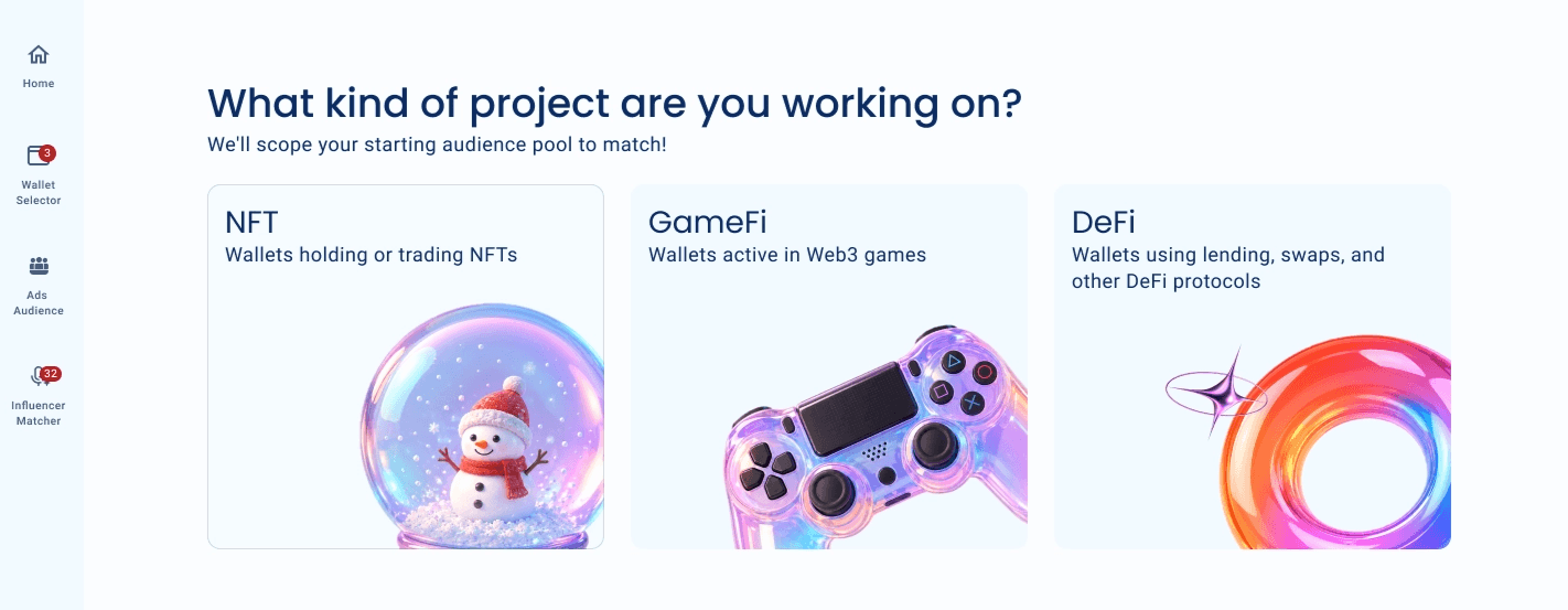
Start with relevant audience pools
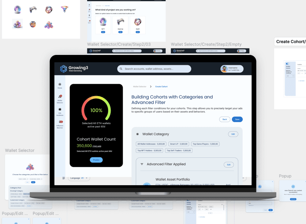
Instead of giving marketers a blank slate, I created pre-selected pools based on project type — such as GameFi, NFT, and DeFi.
Each pool narrowed the available data to signals that were actually relevant to that campaign.
Less configuration, fewer irrelevant choices.
Keep the estimate visible while filtering
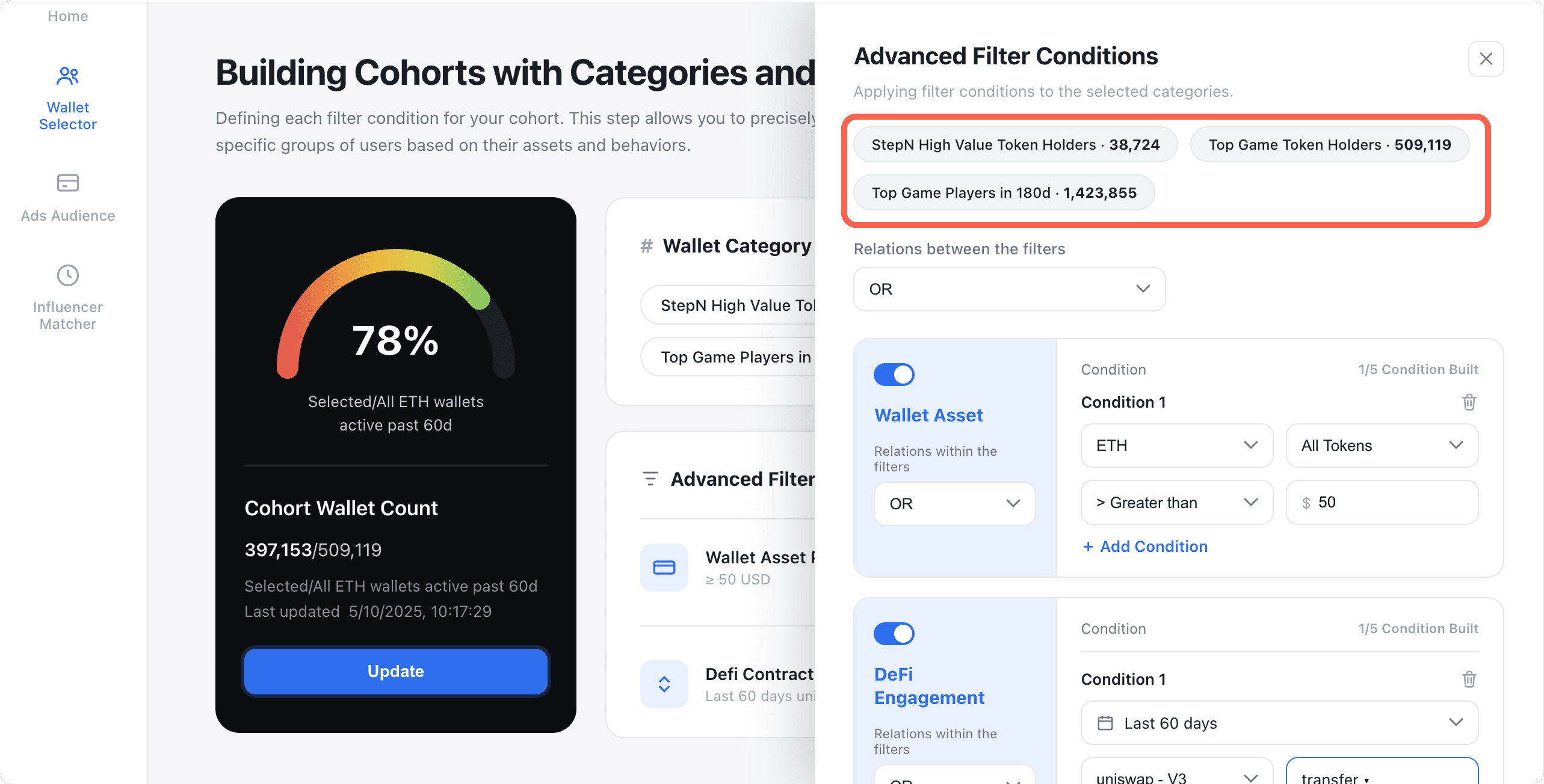
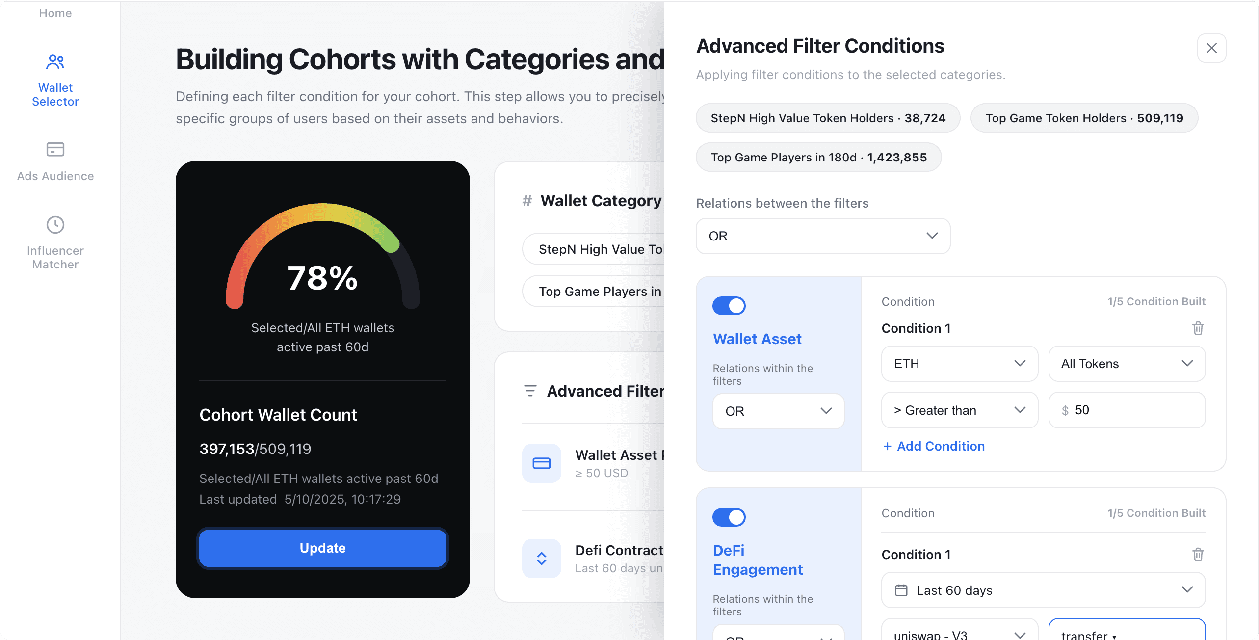
I moved cohort building into a slideout instead of a separate full-page flow.
This let marketers adjust filters while keeping the estimated audience size visible.
The estimate used our cached data rather than triggering a new API request after every change.
Let users adjust instead of restart
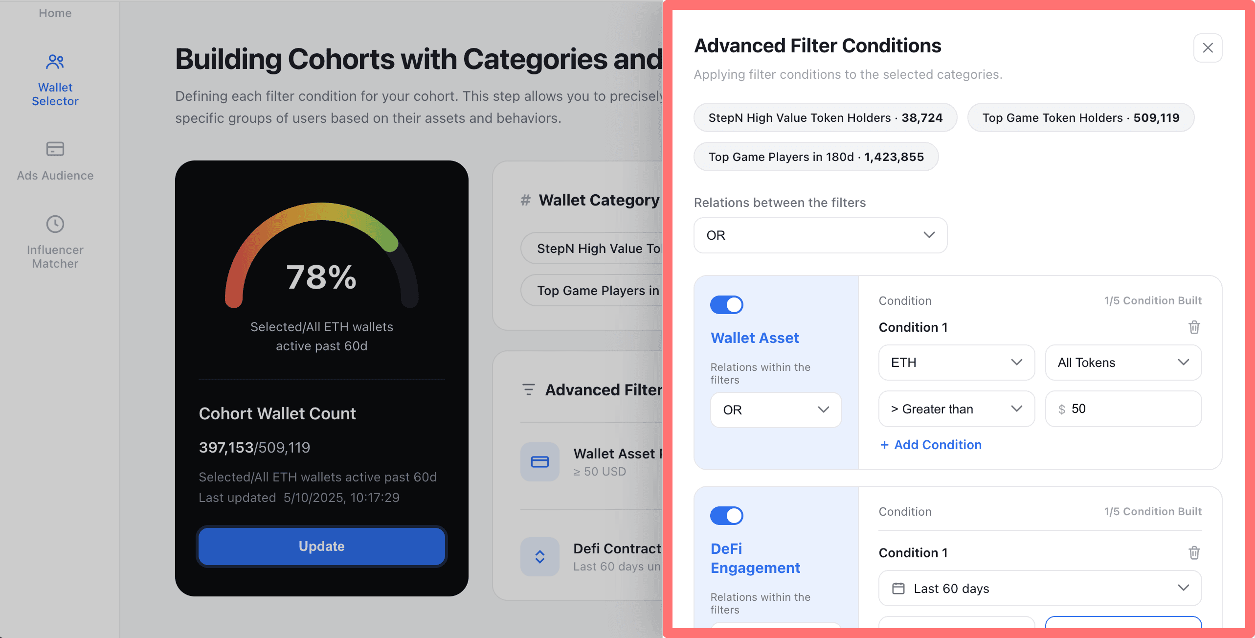
If the final audience was too narrow or too broad, marketers could reopen the slideout and adjust their filters immediately.
They didn't have to rebuild the cohort from scratch.
Show the signal, not false precision
Our data was cached rather than fully live.
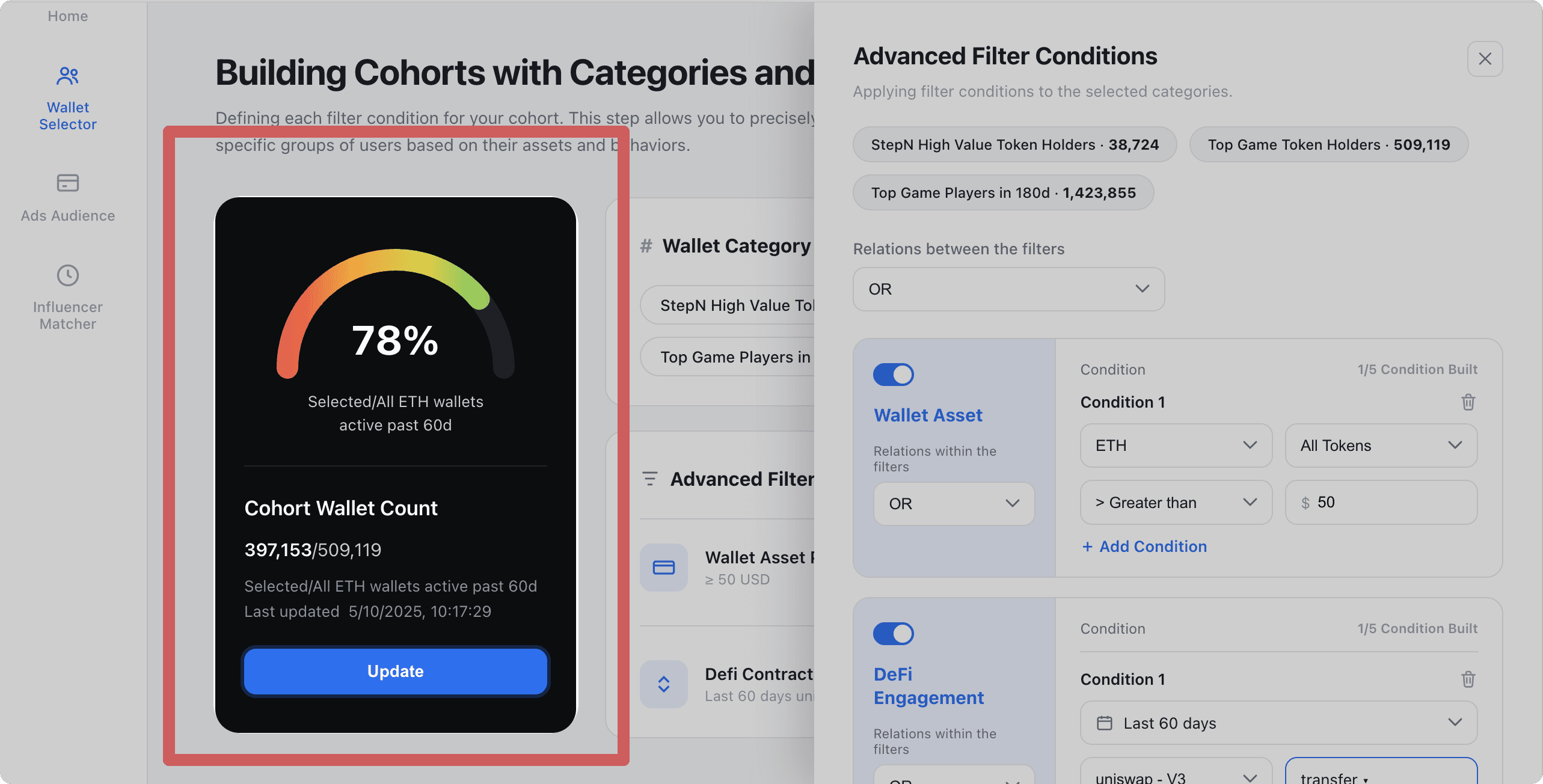
Showing an exact number like 1,284 wallets suggested a level of precision we couldn't guarantee.
So instead, I showed the audience as a percentage/range.
What marketers really needed to know wasn't the exact wallet count.
They needed to know whether the audience was too narrow, healthy, or too broad.
From complex data to a usable marketing workflow
The final experience hid most of the blockchain complexity behind a workflow marketers already understood:
Choose an audience → refine it → sync it → launch a campaign.
This allowed clients to perform work that previously required our team to build manually.
Outcome
Clients later described the experience as "surprisingly easy," despite the complexity of mapping wallet behavior to usable marketing audiences.
Growing3 is a tool that has significantly benefited my work, providing a seamless overall product experience, especially in terms of user experience, which left a strong impression on me!
Project Manager @PrismX